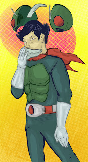
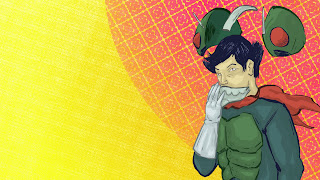
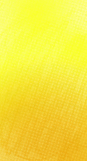
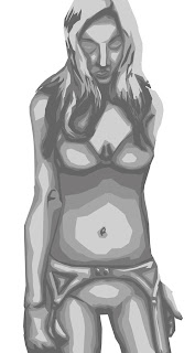
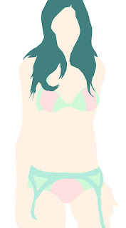
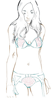
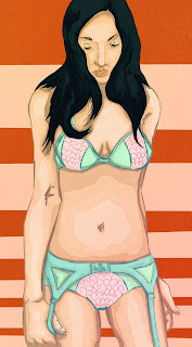
As promised here is a new background it is the current one on my mac if u like it but it doesn't fit your screen well I'm more then happy to make a
resized one for you. Now onto the main part of this post the tutorial.

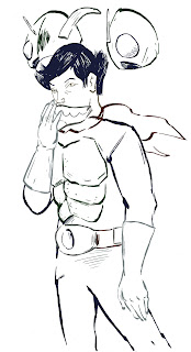
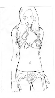
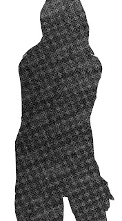
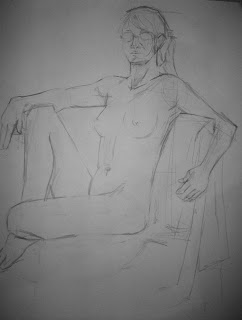
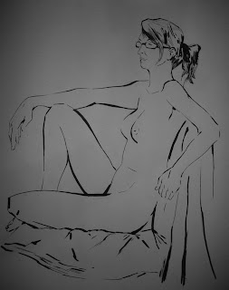
1. The first step in my process is to of course scan. I have a crappy HP scanner printer combo that I currently use hopefully I can get a better one soon. I scan pictures in on
grayscale at about 300-600
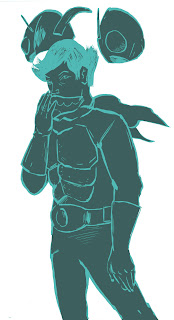
dpi. From this point i start to refine the line art first by erasing then by using various adjustment modes. once i have finished refining i use the magic wand and highlight the line art. next i open a new layer and fill in the selected area with an absurd color this time it was a light blue.
 2. This time i decided to go with a different method to reach the final piece. This time I decided not to use a greyscale, instead I opened a new layer and began to fill in the figure with one solid color to do this I used the point version of the lasso tool.Usually i use the color that will be used the most in the final piece

3.Next I take the solid color and star to divide it into the correct color for that area.i do all of this on a single layer when choosing the colors I try to either go warm or cool for this picture i went for mostly cool colors.
 4.Once I have all the areas to the correct color I duplicate the layer. with the duplicate I adjust the colors using the light and contrast adjustment mode. I usually move the color or contrast up or down about 10-15 points. After I have a color difference I'm happy with I break out the point lasso tool again. This time I start to cut away the lighter or darker areas depending on if I'm going for light or shadow.

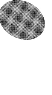
5. I created a texture for the background now this is the area where my original idea and final product differ. when I went to make the oval for the background originally I was planning on making it a bunch of dots that were big on the inside and shrank as they went out. In a new document I was playing around with dot patterns and ended up making this one I ended up really liking it even more then my original idea so I went with it
 6. The next step was to make it colored. I did this by using the wand tool to select the pattern then i opened a new layer. In the new layer I did a circle gradient over the selected area so that it would have a fading effect. Once done I looked at the color I wanted a very hot pink but then found out this didn't look as good as I thought it would so tried to use different effects on the layer I end up using overlay
 7. Then I went to finish the figure up by changing the line color from the absurd light blue to darker versions of the local colors. This was done with the point lasso tool and the paint brush.

8. The final thing I did was make the background, to create the background I first filled a layer in with a strong yellow. the next thing was to make a orange gradient coming up from the bottom one this was done i decided to add a texture to make it more interesting visually. i put the texture on a different layer and set it to softlight.

and then i was done at this point i looked it over and made small adjustments
