Saturday, December 19, 2009

SAMURAI !?!

So i finally came back to my blog...... well i decided to drop these pics I did recently hopefully i get a bunch more done before school is back in secession. well these we done in a moleskine with a staedtler calligraph duo marker i love it cant wait to make more pieces with it


Thursday, October 22, 2009

DnD


my recent illustration the photo isnt the best but tell me what u think

Saturday, October 10, 2009

forget emotions, move with the momentum

im sorry the few viewers i do have i have been slacking off on my dutys to update well im going to try to change that sometime soon im going to do a super scanning section and scan in a years worth of skecthbook work that for some reason i havent scanned so some day soon my deviant page is going to get a flood of new art i will also be putting a hunk of it up here

but on other notes right now im working on a dnd illustration for class when im doen i will do a big post on reference mid work and the final piece

as of late i have been trying to work alot of process out in my mind and figure alot of things that i always had a problem with in art out so...... i have been hitting some walls but i think i have breaking most them down and im starting to understand more

ok so on with the show for people like me who dont really go to art blogs to read here are some sketches i did today
and here are two pictures from an old sketch book

Wednesday, September 9, 2009

First and Second Assignments

our first class assignment was a monochromatic double self portrait painted in acrylic i felt like it turned out ok could have been better but im not the most comfortable with monochromaic painting

for our second class assignment we are making a mural for the city of Warrensburg
we need to make a plan that would work as a proposal to the city we need to find out what we would use where we would have it put a amount and such

ok well lets get this started for a location i chose one right buy the city hall its a wall of a local shop
i would have the exact spot flattened out and smoothed before painting to make it easier then painting on brick i would use acrylic paint to paint my mural it being outside i feel like i would need to use something durable for paint i found this website
http://www.rexart.com/liqjarcolor2oz.html

and i found this article to help inform me on what products to use for mural painting
http://www.rexart.com/appmuralprep.html

after the painting was done i would probably varnish it to make sure it was sealed the article gives u a good idea on how to do that and on other things to think of when painting a mural

here are some of my sketches

Wednesday, August 19, 2009

SCHOOL!

t day is the second day of classes I'm glad to be back I'm in the computer lab in the art center right before my last class of the day modern art something rather its another McDermet class this ones supposed to not be to bad i will see

otherwise classes don't seem to bad physics maybe interesting i don't know if that's a good or bad thing well i bring art this time so yay this is a sketch book page from physics today(click for a better look)

Saturday, August 8, 2009

PICTURE-LESS UPDATE! secret work!?!?!

so yea this update comes with no pictures but im sorry thats not because im not making art no its the opposite of that im making work that im happy with and i feel like im moving forward

but right now that work is going to be a secret for this reason
im working on a book with my good buddy dustin williams and would like the book to be of work that isnt already out there it will be a small colab book with a small run if u want a book drop me a line
once the book is made i will get some pics up

well next post i promise to put up some art well peace

oh a drop a comment or two i would love to hear from anyone if anyone is out there

Wednesday, August 5, 2009

TEST

i decided i wanted to goof around alittle and try some things out that i was thinking about so here we good

this is a using all black line not colored bacock mentioned it so i thought i would see how it looked
this is taking away the color a friend told me he liked it more without color so i thought i would check it out and get ridd of the pinklast was a trying the last one out with black instead of a blue pattern

Sunday, August 2, 2009

Reflection

this class has been a very good class i have learned a lot and really enjoyed it
coming in i had a little knowledge about digital art
i would look at a piece and could tell its digital but i wouldn't have a clue on how to do it. after this class i have more knowledge about what i would i use and what tools to use

i think the format of the class was a good thing. Doing a master study then an interpretation really helped me learn the skills that i wanted. it helped me to learn from artist i like and to know how to do what they did

after this class i think i will now do more master studies in my free time because i now see how valuable it is to do them

thank you for having this class Babcock and thank you for all the tutorials you put up

final and reflection part 3

this is the image that i used for reference this time i was going to do another interpretation of my first project i will be using only photoshop
i started out by making a blackout of the image. i will be using this as a base
next i filled in the color sections with flat color using a solid brush
i then added some detail to the arms to break up the black

after the initial color i add in the smaller colors mainly thread and cloth


after this i started to build up the chest by adding in a middle color and a white this was to make highlights in the raise
in this step i added in green at a little less then 50% opacity this was to help break down the solid colors
next i added in some bright white on the face and the sode(shoulder pad)
last i added in dark shadows to make the whole thing more 3d
im not finished and wont finish it before class is through but i plan to keep working on this and learn more in the following weeks i plan to finish this up and post progress

after im done with this i will move to making another interpretation of my last project i will probably do master studies so that i can learn more and do a better interpretation of it this time

final and reflection part 2

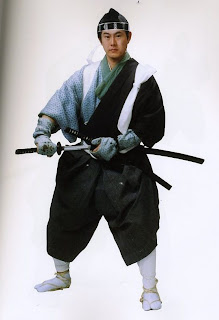
my first step was getting a picture i own a book that is full of people dressed as samurai and other feudal Japanese clothes its a great reference book and i thought i could use it for a base for this finally instead of sketches
so i scaned the picture in and opened it in illustrator
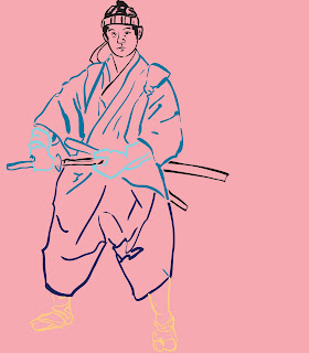
once in illustrator locked the layer and opened a new layer for the line art. i used the blob brush to do the line work after useing the blob brush multipull times it has probably became one of my favorite tools i turned the variation up alittle. after i drew it out i broke some of the lines and started to make them different colors
http://ucmconnect.ucmo.edu/p71524269/(class tutorial on the blob brush)
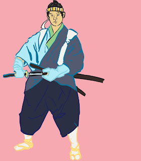
once i was done with the line work i moved it over to photoshop i started by locking the line aart layer then i added in a pink background on a seperate layer and lock that layer too. from there i opened a 3rd layer and named it color here i layered in flat color for the base of the illustration
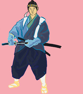
after this i opened up a new layer and filled the layer with a color i think it was orange from there i went to filter and clicked on pixelate then color halftone i chose 8 from there i went to channels and got rid of the blue and red channels and chose the green channel and the dots it left from here i made a pattern out of it then i filled a new layer with the pattern and turned the channels back on. i did this again but this time i kept the blue dots they were bigger
after this i made another layer i used the halftone pattern filter it is under the sketch filters i used horizontal lines
once all 3 of these layer were made i started to change which ones u saw where and played around with them creating textures
sadly i forgot to save pics of these steps after this i merged the 3 layers together and started to erase to create highlights this was a new idea i thought of and decided to try
http://ucmconnect.ucmo.edu/p31089225/ (class tutorial of the pattern technique)

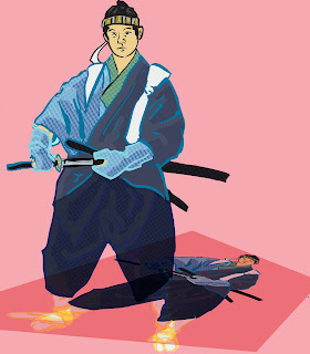
once i was done with the pattern i decided i want to finish it up with making a shadow the way i went about this was by coping the layer then putting it in multiply and then using the skew function under transform i skewed the new one that was on top after skewing it to the way i wanted i locked it

then last thing i did was create a Moire pattern this is kinda hard to explain easier to watch heres the tutorial babcock did for it http://ucmconnect.ucmo.edu/p31089225/ (its the same as the one for dot patterns) once i made the two layers i moved them around and skewed them till i was happy with the effect from there i opened the skewed layer i made before and started to erase the shadow image out this took awhile because i didnt want to screw up
there is probably a better faster way but that ok im happy with the result

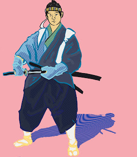
overall im very happy with this piece and feel i learned alot from doing the master study and two interpriations from this point i want to expariment more im really starting to like the pattens and how they can add texture

Saturday, August 1, 2009

FINal and reflection part 1


For my final and refletion i decided to go back and redo my interpretations but because of needing to move this last week and other things coming up i only got 3 of the 4 done but im still happy with what i got done i will post a post for each of the interitation tutorials hope these are informative to what i did and how i did them any questions or comments would be greatly apprieciated

the first thing i did was get a image i like normally it would be a sketch or other line art i liked but for times sake and for an experiment i decided i would use pictures from a samurai reference book
the one above being one

the first thing i did was open the picture in illustrator and use the blob brush to make line art of the pic i used the blob brushes variation to make the lines have a little character i still think i could have pushed this a little more but i will try experiments like those in the future
after i have the line art done i move it to photoshop i start by putting a flat color in for a background i chose green to offset the pink i was planing to use. once i had the background in i opened a new layer and colored the image i used pretty flat color like paul pope did in the piece i made a master study ofand lastly i added a layer over the last one which had a see though look to it to help create the effect of a semi transparent garment i used the brush tool at 30% and went over it a few times

overall im happy with what i learned this is a nice way t make a sketch or simple drawing more appealing its a pretty simple and fast way to color once u get use to it

Thursday, July 30, 2009

harder then i thought...


i tryed my hand at a interpritation
i have got to say it was alot harder then thought it would be i think im going to have to do some more master studies to better understand these but this is what i got im kinda happy with it

so far im gettign pretty far in my final i should get it done tomorrow

Monday, July 27, 2009

slow week


the original is the one on top
my study is the one on the bottom this one was hard
and i dont think mines nearly as smooth
i found this image when i was randomly searching online its from an up coming game
i like how it uses hard and soft shapes of color together

so i didnt work hard nor fast this week i still have a hunk left to do on my interpretation
but i plan to do alot better next week
for my final i plan to do new interpretions of all my previous projects i will be useing images i have from a samurai costume book

Sunday, July 19, 2009

JUMP! improved

i took babcocks advice on making the dots smaller and redoing my Moire pattern
i think it looks better now otherwise i did a few more tests with the dots and patterns for fun

Saturday, July 18, 2009

JUMP!

this is my interpretation i enjoyed making it
im pretty happy with how it turned out
i just threw in a back ground i should probably go back and make it look better but this one will do for now i was mainly focusing in on the figure
i like the dots and morray effect i think they are cool effects and i will want to get use to using them and experiment with them more in the future
commets and critiques are appreciated

Thursday, July 16, 2009


finsh i finally finshed my study it was hard to finish. it was hard to match the dots then i thought it would be im still not fully happy with it but i am happy enough to move on
i think i learned all i could but for some reason i still couldnt get my pink cloud thing to completely match the one D-pi made but thats ok i did learn how to use the effect and am happy that i can now do the tricks he did

now im moving on to my interpritation i already started it
and hope to get it done tonight if i keep up at this pace

busy day


today i was rather busy but i got alot of work done too
this is my interperatation for my second study im pretty happy with it now im pretty confident with the blob brush and feel pretty good about it
i think i could have had some more scratchy lines but otherwise im happy with it

otherwise then that i worked on my 3rd master study i still need to add in the dots, tree and do alittle more work but this is it so far

Saturday, July 11, 2009

Pope Study colored

I got off work at 10 and I decided I wanted to color the study I did before I started on my interpretation so I colored it up and now I'm working on my interpretation hope to be get alot of work done before i go to bed

Pope Study


for my next master study i did a linework study of Paul Pope's work this piece is a part of a poster from his book
the reason i chose this project was to help understand how to do line work using illustrator i started off by using the pen tool this took forever and got ok results i started this when i was in town Babcock asked me why i wasnt using the blob brush well it was mainly because i hadnt used it before and didnt know the tool
after useing the pen tool more i started to wonder about the blob brush and tried it out
wow i made it all so much easier now i feel like i wasted alot of time on this because i didnt use the blob brush from the start

well otherwise im pretty happy with the result
my plan for my interpritation is to scan a drawing from my sketch book and to digitally ink it