 the title says it all

Friday, October 21, 2011
Monday, October 17, 2011
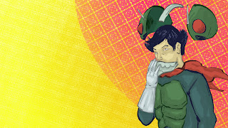
PIMPBOT and more
 Pimp Bot is not my creation it is my friend Jeff Porters i just love Pimp Bot so much that i had to do some fan art otherwise here are a few other sketches i liked


Sunday, October 16, 2011
Influences and future growth
This post will go away from the normal pictures and little talking that this blog is known for instead I'm going to talk to you today about my influences. there are plenty and they are varied.
Paul Pope: Since i first saw one of his comics has been my favorite artist i don't even know how to explain it. to me it feels like his pictures were effortless like they were always there. I also am in love with his inks, he has a very nice balance of busy and calm.
Dan Hipp: I actually first saw Dan Hipps work when i graduated from high school i picked up a copy of the amazing joy buzzards. i dint really discover i'm again until last year i believe i was on ffffound.com and someone had posted one of his pieces up. From there i went to his website and feel in love. He always seems to have a great composition, but the main thing i love are his vivid colors they are to die for. if i could even have a fraction of his awesome fearless coloring ability i would feel blessed.
J.H. Williams III: was introduced to me by my friend Alex Mann when i first saw his work i didn't like it at all. A week or so later i came back to look at it and i liked it a little more. Another week pasted and i all of the sudden was in love and had to get my hands on it that was when he was making the first Batwoman. i enjoy his way of mixing styles and amazing page designs he is definitely one of the best comic book artist around.
Ghostco: is a resent person i started to follow i believe i found him through juxtapoz.com. I feel his inks are awesome i enjoy his muted tones when looking to his work it feels soft something that i don't feel I'm to good at but would love to learn how to do.
Roxie Vizcarra: I first found Roxie's art on deviant art by complete accident. I love her work because its loud and different. Her work reminders me of others but it also has its own strengths
D-pi: Has a great way of combining things he loves the two biggest seem to be hip-hop culture and ninjas. otherwise he has a nice use of line
my future plans are to become a lot better with my use of ink and to understand use of line better. i feel like to strength my voice i need to focus on the core or my work which i feel is the ink work.Other things i have been and will continue to work on is use of texture and color both these are really foreign to me for the longest time i was all about black and white pictures and stayed away from color. Even when i used color i didn't use it in any form that i would consider good. i feel that my colors weren't brave enough they were just local colors afraid to be neutral or vivid since then i have found artist that i feel are masters of color. the master( at least i think so) of vivd color would be Dan Hipp as i spoke about before. the master of neutrals is ashley wood.
i promise the next post will be back to the norm and it will be soon until then.
i promise the next post will be back to the norm and it will be soon until then.
Friday, October 14, 2011
Monday, October 10, 2011
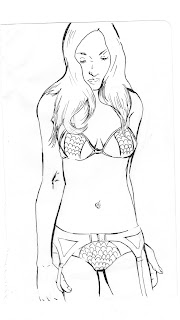
A New Background and Another Tutorial
As promised here is a new background it is the current one on my mac if u like it but it doesn't fit your screen well I'm more then happy to make a resized one for you. Now onto the main part of this post the tutorial.
1. The first step in my process is to of course scan. I have a crappy HP scanner printer combo that I currently use hopefully I can get a better one soon. I scan pictures in on grayscale at about 300-600 dpi. From this point i start to refine the line art first by erasing then by using various adjustment modes. once i have finished refining i use the magic wand and highlight the line art. next i open a new layer and fill in the selected area with an absurd color this time it was a light blue.

1. The first step in my process is to of course scan. I have a crappy HP scanner printer combo that I currently use hopefully I can get a better one soon. I scan pictures in on grayscale at about 300-600 dpi. From this point i start to refine the line art first by erasing then by using various adjustment modes. once i have finished refining i use the magic wand and highlight the line art. next i open a new layer and fill in the selected area with an absurd color this time it was a light blue.
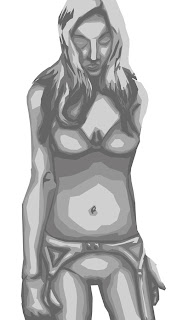
 2. This time i decided to go with a different method to reach the final piece. This time I decided not to use a greyscale, instead I opened a new layer and began to fill in the figure with one solid color to do this I used the point version of the lasso tool.Usually i use the color that will be used the most in the final piece
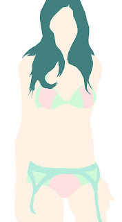
3.Next I take the solid color and star to divide it into the correct color for that area.i do all of this on a single layer when choosing the colors I try to either go warm or cool for this picture i went for mostly cool colors.
 4.Once I have all the areas to the correct color I duplicate the layer. with the duplicate I adjust the colors using the light and contrast adjustment mode. I usually move the color or contrast up or down about 10-15 points. After I have a color difference I'm happy with I break out the point lasso tool again. This time I start to cut away the lighter or darker areas depending on if I'm going for light or shadow.

5. I created a texture for the background now this is the area where my original idea and final product differ. when I went to make the oval for the background originally I was planning on making it a bunch of dots that were big on the inside and shrank as they went out. In a new document I was playing around with dot patterns and ended up making this one I ended up really liking it even more then my original idea so I went with it
 6. The next step was to make it colored. I did this by using the wand tool to select the pattern then i opened a new layer. In the new layer I did a circle gradient over the selected area so that it would have a fading effect. Once done I looked at the color I wanted a very hot pink but then found out this didn't look as good as I thought it would so tried to use different effects on the layer I end up using overlay
 7. Then I went to finish the figure up by changing the line color from the absurd light blue to darker versions of the local colors. This was done with the point lasso tool and the paint brush.

8. The final thing I did was make the background, to create the background I first filled a layer in with a strong yellow. the next thing was to make a orange gradient coming up from the bottom one this was done i decided to add a texture to make it more interesting visually. i put the texture on a different layer and set it to softlight.

and then i was done at this point i looked it over and made small adjustments

Saturday, October 8, 2011

Thursday, October 6, 2011

Wednesday, October 5, 2011
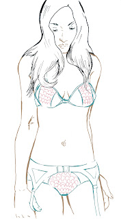
Tutorial
So here is the tutorial i promised
i first started off with drawing it in my sketchbook then i inked it after scanning it i start to refine the ink
the next step i took was making a grey scale for the picture
next i created color i duplicated it to help keep the color working well the first set of colors i put the layer on overlay mode. the second set i put the layer on multiply
the next thing i did was change the line colors i decided to make them a dark shade of the color of the area
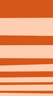
then i felt like i needed to make a background i decided to go for a basic stripe on i seem to like stripe backgrounds they aren't completely simple but they are not complex
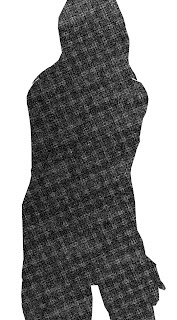
then i made a texture in a new file i imported it in this was to add some more interest to the piece

after that i added an overlay of these bright colors to add a little more to it i turned the opacity so low that u barely can see it
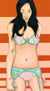 and this was the end result

i first started off with drawing it in my sketchbook then i inked it after scanning it i start to refine the ink

the next step i took was making a grey scale for the picture

next i created color i duplicated it to help keep the color working well the first set of colors i put the layer on overlay mode. the second set i put the layer on multiply

the next thing i did was change the line colors i decided to make them a dark shade of the color of the area

then i felt like i needed to make a background i decided to go for a basic stripe on i seem to like stripe backgrounds they aren't completely simple but they are not complex

then i made a texture in a new file i imported it in this was to add some more interest to the piece

after that i added an overlay of these bright colors to add a little more to it i turned the opacity so low that u barely can see it
 and this was the end result
Tuesday, October 4, 2011
Colored
 here is the colored version of something i posted earlier tomorrow or the next day i will be posting a tutorial
Sunday, October 2, 2011
Drawathon6
 well we had another drawathon above is the wall of everyone at the drawathons work when i left i left before the last model because i had to drive home last night
below is my work from drawathon sorry the pictures are so dark im not to good at taking photos of my work its something i need to work on well enjoy


Subscribe to:
Posts (Atom)